Time in reports is stored in UTC so what you are looking at is supposed to be your local time zone converted by your browser accordingly to your settings. There is simply no time zone there
Of course what could go wrong will always go wrong. Can you tell me exactly what you see and what you expect to see and on what graph/feed
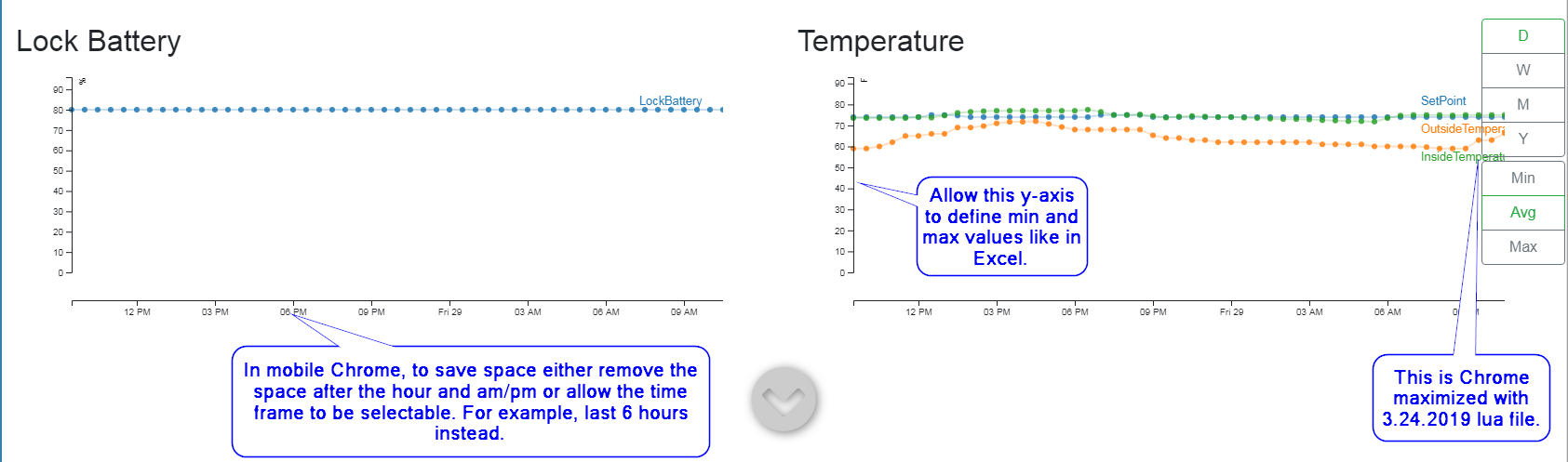
In both mobile and browser view, can you allow us or change the max/min values on the y-axis? For example, it’s difficult to see individual variable results on the graphs. While I know I can look at the feeds the graph itself is too scrunched.
Perhaps also allowing us or pre-set options to change the time range from 24 hours to 12 hour view. That would also prevent the graphs from being squished.
Hi ipstas, I noticed that after using the 3.24.2019 lua version you posted that when full screen or un-maximized in Chrome, the values of the graphs are on top of the options on the right side.
I’m unable to. I have been trying to upload a png to show you but something might not be right with the new site for me, it stays at 0% and never uploads. I’ll come back to you when its sorted.
That’s number of readings currently on the graph. Default is 50 and this is why it looks so dense on mobile, the desktop version is OK with 50.
So the next version should have different # for mobile/desktop, also it should allow you to slide beyond 1 last day and automatically load more readings from the backend as you are sliding. Currently the Day graph is limited to past day and 50 readings.
But it is going to be a major update, will not happen too soon
@ipstas in the pic I see that the variable list of the temperature graph is in the opposite order of where the data points and color are.
Not sure how to ask this but could the variable names coincide or be near their associated data points? I know the values could spike so maybe dynamic placement of the variable names.
Do you mean the Y axis on the left and the var names on the right? And you would like to have names placed where the right end of the line associated with that var?
Did I get it correctly?
Supposedly you have a temp graph like this:
It is would be hard to place all these names and not have them interlapped
It is not easy, when you have more than few and they are ending in close proximity you have an issue with all names getting in the same place. To calculate on a fly the distance between them to keep them separate could be big thing.
As I understand you just want to have a better visibility what line belongs to what variable. Do you know you can hover over the line and it will be highlighted together with the var name and the rest will be muted?
Another solution can be to make them clickable. So you click on a line/var and the rest goes hidden, you have only one uncluttered line/var on a graph. Click a 2nd time and it goes back to initial state
Ok those ideas work too. So last statement on it then. Can you make it so the colors of the data points match the colors of the respective variable name?