Hi Patrick, I’m loving v3.x, it’s great but there’s a UI element that has been triggering my OCD for a while now - I didn’t bother bringing it up before as the 3.x upgrade was more important. This particular item was inconsistently applied in earlier versions, but now in v3.x it’s consistently sub-optimal (IMHO of course).
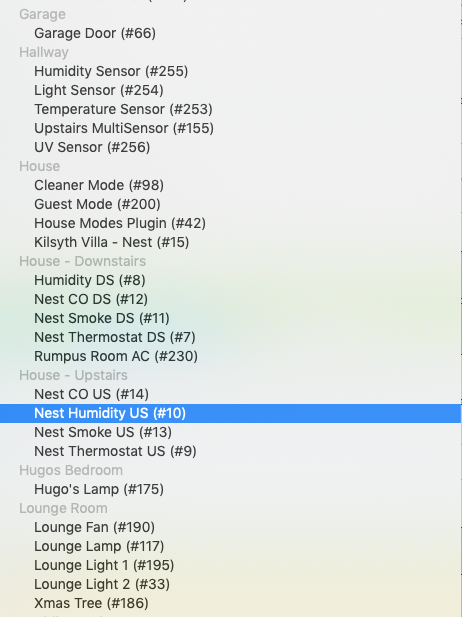
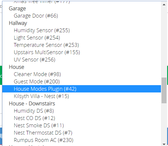
The issue is the list displays - they are really hard to read in both Conditions and Activities as the headings are light gray and the sub-items are black. In the prior versions at least (iirc) the lists in Activities had Bold Black Headings and regular Black fonts for sub-items. This latter approach was super easy to read as you could quickly scan for the room and then pick out the device - I’d really love to see this approach consistently applied. When you have as many devices as I do, you need to find the Room first, device second.
I’m using some HTML5 elements for this, and their appearance is controlled by either the browser’s native style sheet or Vera’s. I’ll look into this. That’s definitely not a readable intersection of colors.
So, the consensus at the moment seems to be that CSS is pretty limited in this area, so the bad news, I can’t do anything fancy at the moment. But the good news is, it seems changing the color of the item is universally supported, and I think that’s all that’s really needed, so I added this to the CSS for 3.2. Relief is at hand.