Not a fan. Huge amounts of white space everywhere. Quoting seems inconsistent. Unread / New topics don’t really work the same way (despite discussions with @Sorin, sorry chap)
Replying to one post, it’s less easy to then reply to another on the same thread.
Hiding content <> hiding a post
Yes, I found this on my iPad. But it turns out that if you temporarily hide the keyboard, with the button on the bottom right, then you can scroll back through previous posts.
I didn’t expect this new platform will be everyone’s favorite dish and I can agree with that. A change had to be made and building on SMF is practically impossible. It was a good platform for a startup or a small business but its usability doesn’t scale for business and security.
We have been constantly bombarded by armies of spam bots every day. Unless you wanted to reply with a captcha on every post and have an army of people of manually approving posts that had to end.
If we wanted to enable any kind of conveniences like Oauth or rich embeds of media, or any type of customization, we had to hack these in. And this is just the tip of the iceberg on why we had to lose SMF fast.
I’d suggest asking if what you’re looking for can be done and if it’s something that others will like too, maybe we can work it out. I made a lot of changes already, based on your feedback.
We didn’t try to reinvent the wheel here, we just went with a modern and proven platform already in use but other big players like Twitter Dev Community, Amazon, Hubspot, Patreon, Udacity, Code Academy, and many more.
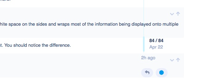
I’ve extended the content some more. It’s now about 75% content. You should notice the difference.
I’d also suggest the Dark theme, easier on eyes.
I don’t understand this.
I don’t know what you mean. Not sure if it’s something that I can do in this sense but I’m surely opened to suggestions.
Tell me what do you think about it now.
If you guys think this is some kind of a bug/issue I can report that if I understand what do you mean, and maybe it can be addressed.
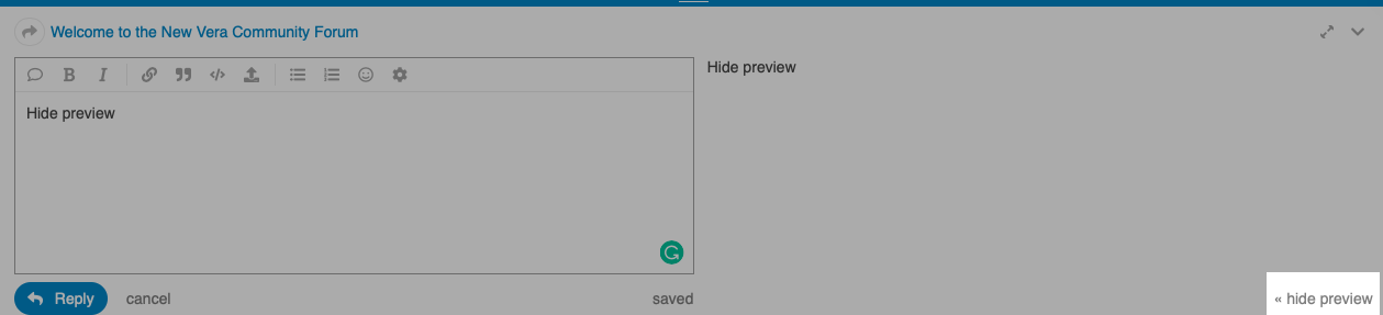
Still too much whitespace on my macbook pro for my taste. The live preview is completely pointless IMHO.
Why are new topics not classed as ‘unread’
Why are topics which you’ve just read still displayed (albeit in grey) I don’t get the point in that.
Oh, and maybe 40=% of the time, when I access:
I get a completely white page…
Never seen a forum like this (no matter which other of the big boys use it)
Looks good to me,
As with everything else, you can’t please all the people all of the time.
In other words, Sorin you’re on a Mission Impossible, keep up the good work.
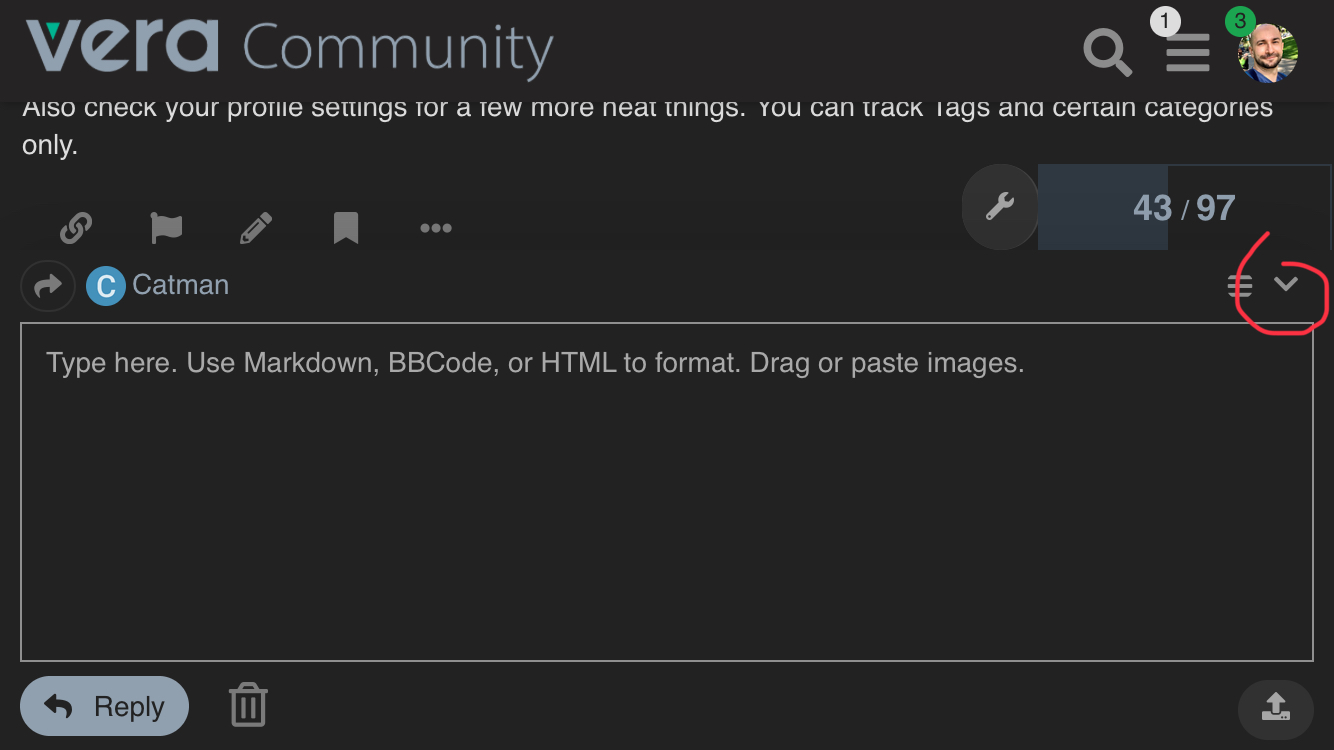
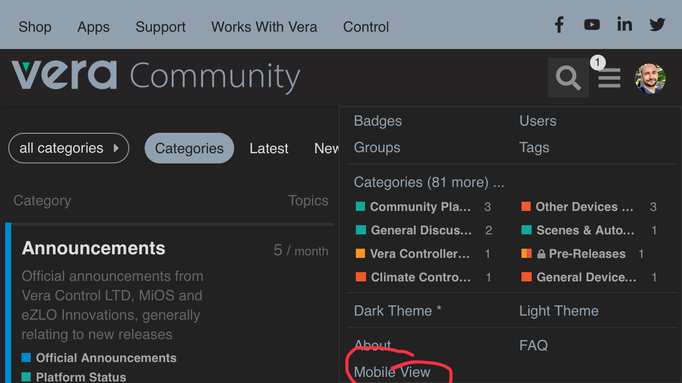
Also, I suggest swapping to the Desktop view, instead of the Mobile one, and it will give you a scrollable screen with the editor open, with a bit more screen real estate.
You can minimize the editor, and it keeps the draft and even the cursor position is if you want to read the thread and quote something you can easily do that. I’m replying this from my old trusty iPhone 6
@Sorin sorry chap. Genuinely not having a go (and you’re not going to please everyone so why should I expect to be happy at the expense of others) but that’s just, well…