It is not easy, when you have more than few and they are ending in close proximity you have an issue with all names getting in the same place. To calculate on a fly the distance between them to keep them separate could be big thing.
As I understand you just want to have a better visibility what line belongs to what variable. Do you know you can hover over the line and it will be highlighted together with the var name and the rest will be muted?
Another solution can be to make them clickable. So you click on a line/var and the rest goes hidden, you have only one uncluttered line/var on a graph. Click a 2nd time and it goes back to initial state
Ok those ideas work too. So last statement on it then. Can you make it so the colors of the data points match the colors of the respective variable name?
Names are already color matched to lines. Or you have asked something else?
I triple checked, looks good now. Sorry about that.
Hello @ipstas,
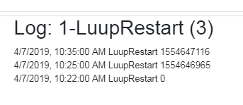
Using System Monitor plugin from apps.mios.com, the Epoch time for Luup restarts is captured. When graphing this, the Epoch value on the graph is a different number than the feed value captured. Not sure if some math is occurring. The feed shows the correct value.
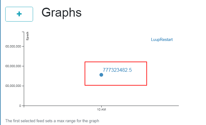
Oddly, it seemed to work itself out now. It displays the right number now.
It is averaging. So if you have just started reporting it and it was nothing there before it would show half of the real value. And then it will catch the real one since it is a previous value and not 0
Ok, didn’t think of that. Thanks. I’ll be adding some more of the system monitor variables for graphs and things are looking good so far!
Can’t wait to see what’s in store in the future.
Looking through a keyhole ![]()
- specific energy dashboard (like Ergy, but better) with pricing and bill estimate;
- push notifications;
- sliding beyond the last day;
- Vera plugin to get rid of text config;
- Feedback to Vera so it can activate scenes/devices;
- Android and iOS (later) apps.
and of course other things we have discussed
UPD: hovering over the name on the legend or line would mute other names/lines to make viewing graphs easier
I like the hover, works on mobile too. That’s cool!
1 Like
@ipstas - when clicking the down arrow to load more graphs, all graphs reload which is kind of slow, even if the graph was already loaded.
Also, since I’m adding more graphs thanks to the System Monitor plugin, can the dashboard be defaulted to view all and load rather than having to hit the down arrow to load more? I’ll have to hit it twice to view all.
Thanks!
@ipstas - can you give more information on “calculate a function”? How does this work and what benefit or advantage does it have?
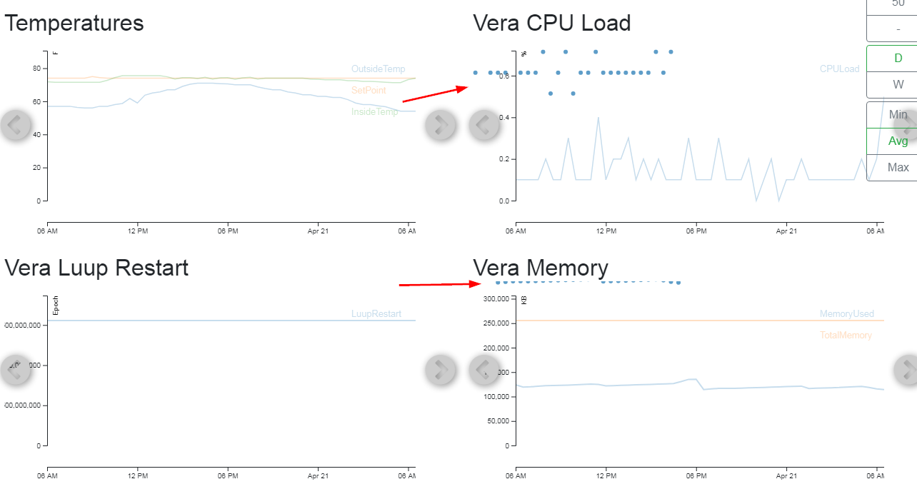
Also, in my luup restart graph, the System Monitor plugin is using Epoch time. On the graph, the change in value is way to small to see because I can’t set the min/max boundaries of the graph.
@tomtcom About slow graphs. Yes, we hit some db degradation already. It should be fixed for now
I will check the rest later
Definitely a lot better now, thanks!
@tomtcom With calculate function you can arbitrarily send whatever you want to HundredGraphs, you are not tied up to what service_id reports.
Fixed, thanks!
Yeah, we screwed up. But fixed it quickly enough I hope
Hello @ipstas
For calculate function, how might I send data as you mentioned?
I would like to graph readings for my pool such as salinity and pH. I want to manually add the measurements and graph it.
Can you tell me more on this?